Some websites just feel expensive. You scroll, and the page responds: light shifts inside a photograph, a headline brightens word by word as it passes, a product turns slowly as if someone is holding it up for you. Nothing on the page is a gimmick, but everything is slightly alive.
That feeling used to be agency work with an agency invoice. This post is about getting it from a prompt, and just as important, about the rules that keep motion from making a site worse.
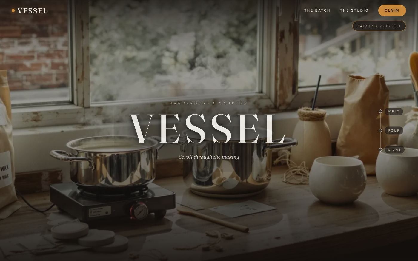
Two live examples to set the bar, both built on Instroc and available as templates: Vessel, a product page where the product turns as you scroll, and Lagoon, a resort site where the scenery moves like an opening shot. Scroll them on your phone first. Everything below is about how that effect is made and when to use it.
The difference between motion and decoration
Most animation on the web is decoration: things fade in, icons bounce, elements slide around when the page loads. Visitors stopped noticing years ago.
Motion that works is different in one specific way: it is driven by the visitor. The page moves because you moved. Scroll is the input, and the site responds in proportion, like a material with weight. Stop scrolling and everything rests. That connection between your finger and the page is what reads as craft.
The house rules
We spent a long time iterating on cinema-style pages before turning any of it into product capability, and a few rules survived every iteration:
Effects ride the scroll, they never own it. The moment a site hijacks scrolling, pinning you in place while an animation plays out, the magic dies. The page must move the instant your finger does. If a visitor ever feels the site wrestling them for the controls, the motion has failed.
Text should move with the page, not fly at it. The best text effect we know is also the quietest: words light up in sequence as the paragraph scrolls through the middle of the screen. It gives reading a rhythm without ever relocating the text.
Motion is a garnish, not a course. One beautifully moving section per screen beats five competing ones. Alternate moving sections with calm ones. If everything moves, nothing does.
Images move inside their frames. A photo drifting gently within its window feels dimensional. A photo sliding around the layout feels broken.
If you ask for motion and describe the feeling you want, these are the instincts the builder applies. You do not have to know any of the terminology.
Filmed sequences: when a photo becomes a shot
The step beyond scroll effects is real footage. On Instroc, Roc can film a scroll sequence from a single still image: you provide a product photo or an image generated in your project, pick the kind of shot, and a few minutes later your page has a sequence that plays through as the visitor scrolls. A candle scene where evening falls and the glow spreads. A slow orbit around a bottle. A camera glide through a scene.
The practical notes, honestly stated: rendering a sequence takes a few minutes, it is a paid feature with a per-render price in credits, and every render charges, so it rewards choosing your shot deliberately rather than rerolling casually. One good sequence in the hero is usually the whole job.
How to actually ask for this
You do not need vocabulary, you need references and feelings. Prompts that work:
Make the hero feel like the opening shot of a film. The photo should slowly come alive as I scroll.
When the visitor scrolls to the mission statement, light the words up one by one as they read.
I want the product to turn as the page scrolls, like someone is showing it to me.
And the most useful one, when you have seen something you love:
Look at how the Vessel template's product spins on scroll. Do that with my product photo.
When not to do this
A booking form does not need cinema. A dashboard does not need parallax. Dense, task-focused pages earn their keep by being fast and boring, and motion there is friction. The pages that deserve motion are the ones doing emotional work: the landing page, the product reveal, the about story. Put the budget where the feeling matters and leave the workflows alone.
There is also a patience cost. Motion pages carry more imagery and sometimes real footage, so they are heavier than a plain page. On a weak connection, a calm fast page beats a beautiful slow one. Good motion sites keep the first screen light and let the cinema arrive as you travel.
Start from the templates
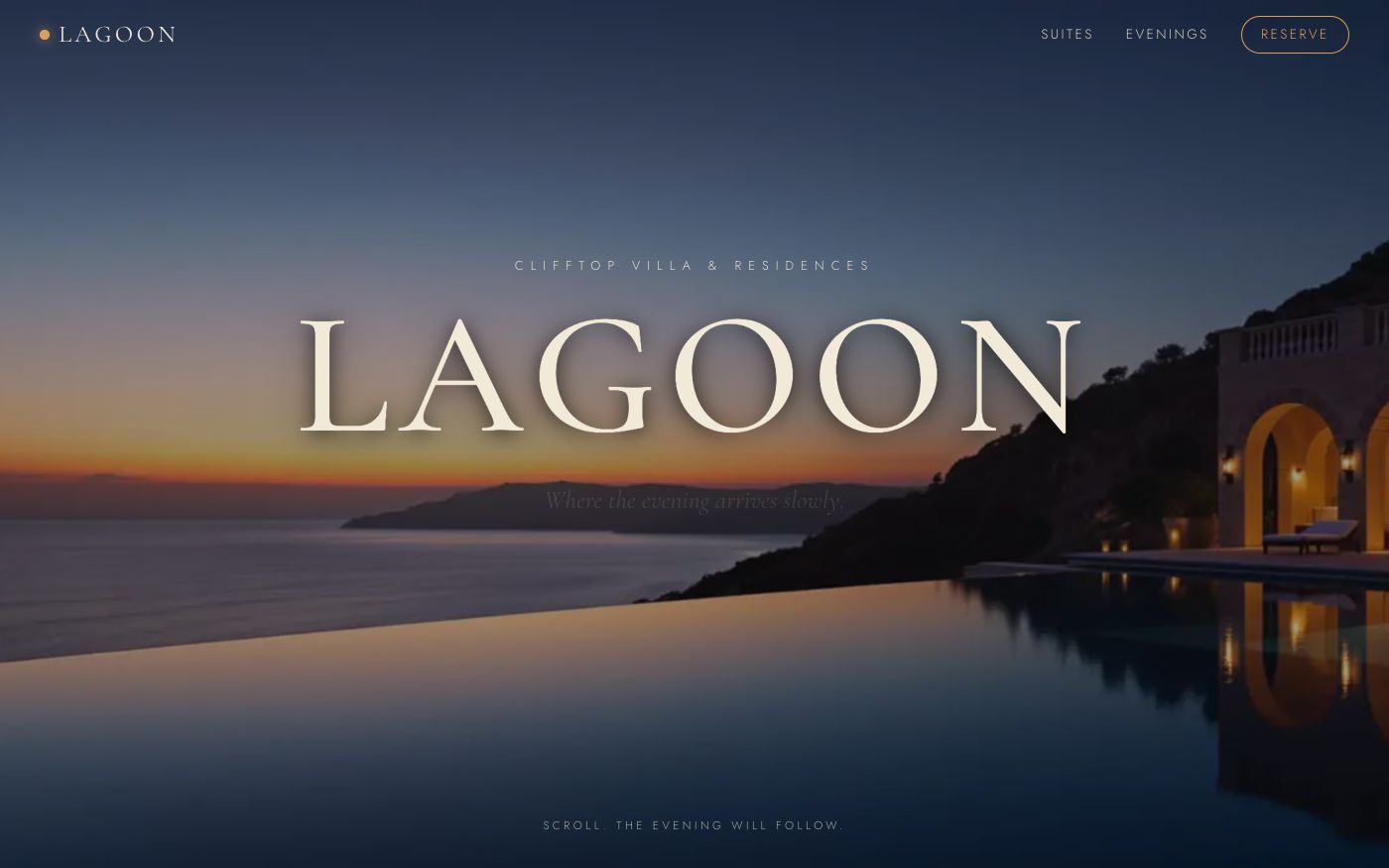
The fastest route is not describing motion from scratch, it is starting from a template that already moves and making it yours. Clone Vessel or Lagoon from the template gallery, swap in your brand and your photos, and ask Roc to refilm the sequences around your own product when you are ready.
Describe the feeling you want at instroc.com. Free to start.